With the advent of 5G open networking, networks have inevitably become much more intricate and complex as they’ve evolved and advanced. This applies not just to the networks themselves, but also to the ceaseless torrent of data they generate. And as I discussed in a previous blog about network management, it’s difficult to bring all that data together and meaningfully interpret what’s going on. Raw data, even data that’s been stripped of “noise,” is difficult for the human mind to process efficiently, as anyone who’s picked through dense, detailed log files will tell you. Although network data is a rich source of information and insight, extracting that value manually is impracticable. That’s where network visualization comes in.
Network visualization is the graphical representation of the devices, components, connections—basically anything and everything that makes up all or part of a communications network, integrated into the network software’s GUI. This includes data about dynamic aspects of the network, such as traffic flows and performance metrics. In some cases, such as Fujitsu’s Virtuora® MC, network changes can be triggered directly from within visualization views.
By using visual representations to represent data from sources such as log files and KPI measurements, network visualization helps users quickly grasp complex information and identify relationships and patterns within the network. It also enables much richer and more valuable network analytics.
In essence, given the complexity of post-5G networking and the variety of devices in a multivendor, multilayer, multidomain network, network visualization is not just pretty pictures. It’s an essential means to improve operational efficiency, network performance, customer experience, and overall business health.
Typical network visualization features
Visual representations of network data can do several valuable things in general:
- Filter out irrelevant or duplicate information
- Abstract information for individualized needs, such as a specific job or level of experience
- Draw attention to urgent information
- Present specific parts of the network such as sites, regions, layers, domains, devices, and interfaces
- Illustrate what’s happening in terms of time – as a snapshot, as it is changing in real time, or how it tracks over a specific time interval
Network visualization can take many forms, each tailored to different needs:
- Topology Maps: The physical and logical layout of a network, showing how different devices are connected
- Performance and Status Dashboards: Dynamic, real-time insights into network performance, showing metrics such as bandwidth usage, latency, and error rates
- Flow Visualizations: The movement of traffic through the network, helping to identify bottlenecks or unusual activity
- Heat Maps: Representations of traffic density and activity levels across different parts of the network, making it easier to spot hotspots of activity or underutilized resources
How visualization helps improve network performance
As AI and ML become widespread across the network industry, the potential is expanding for visualization features to assist operations staff and other employees in improving network performance, customer service, and overall business health. To begin with, visualization cuts through complexity and presents information that’s relevant to the user and easy for the human mind to understand. Visualization also enables urgent information and actions to grab the attention they need; a flashing red light is a simple example. With network devices generating, at times, thousands of alarm messages, operations techs can determine much faster and more effectively which ones need attention when they’re given visual prompts about what and where the source of the problem is.
Visual representations are especially good at showing real-time data, both as it happens in the moment and as patterns form over extended periods of time. As a result, performance monitoring is greatly enhanced, especially when it comes to highlighting anomalous network behavior that could be an early sign of a serious issue. For example, a sudden spike in traffic on a specific device can be immediately visualized to enable investigation of the cause, and the device’s past behavior can be presented graphically to assist with this effort. Visualization of this type enables techs to troubleshoot and resolve problems much faster, with consequent benefit to network performance overall.
Network visualization streamlines network management
Network visualization also helps with routine network management by providing a comprehensive overview of network health. Technicians can easily monitor key performance indicators (KPIs) such as bandwidth utilization, error rates, and device status through centralized dashboards. This helps them prioritize tasks and allocate resources efficiently. For example, if a visualization tool indicates that a specific device or connection is nearing capacity, technicians can proactively manage traffic to prevent outages or bottlenecks.
Network visualization benefits for training & knowledge transfer
Visual tools are invaluable for training new technicians. Complex data can be daunting to new technicians and visualization offers a user-friendly approach to learning, helping newcomers to grasp network intricacies quickly. Additionally, visualizations can serve as documentation, helping to retain knowledge and facilitate smoother transitions when staff changes occur.
Executive & business benefits
Network visualization’s benefits extend beyond operations and management and into the boardroom. Here, visualization aids in multiple aspects of an executive’s responsibilities:
- Strategic decision-making – Executives need to understand network performance to make informed decisions about resource allocation, budget planning, and strategic initiatives. Network visualization can present the key data points in an easily understood format, empowering data-driven decision-making in alignment with strategic and business goals.
- Performance metrics & ROI analysis –Visualizations play a crucial role in calculating return on investment (ROI) for network-related initiatives. Using visual tools to track performance trends over time, correlating these trends with business outcomes, an executive can evaluate investments, such as capital spending on network infrastructure, and determine their impact.
- Risk Management and Compliance – Network visualization can assist in identifying risks such as security vulnerabilities and compliance issues by providing a clear view of network topology and traffic flows. For example, a visualization tool could reveal and quickly draw attention to intrusion attempts or unauthorized devices connected to the network, prompting immediate action to mitigate potential security risks. Executives can use this information to ensure regulatory compliance and safeguard sensitive data.
Fujitsu’s Virtuora & network visualization
As our Virtuora software platform has evolved, visualization has become more and more prominent, since it adds a lot of value for many of our customers. Virtuora MC, for example, provides very rich and comprehensive RAN and mobile network visualizations that enhance user confidence and productivity as well as supporting unified management and control. Virtuora MC also provides personalized, customizable dashboards to empower users in accessing the information they need. The highly customizable nature of this visualization solution provides abundant future service opportunities, and we will work with our customers to assist them in creating custom visualizations to serve specific business needs.
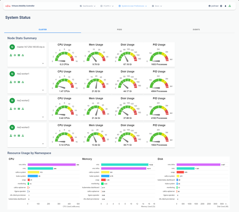
The example screenshot below shows a cluster analysis visualization, which provides various statistics such as CPU, memory, and disk usage; node condition icons and details; and resource use by namespace. Visualizations like this greatly enhance efficient resource utilization as well as helping to anticipate potential issues that might be developing. This example is a role-based visualization used by Site Reliability Engineers (SREs), who play a critical part in ensuring the reliability, availability, and performance of network services. Since Virtuora network visualization is configurable using Identity and Access Management (IAM), only staff with this role would have access to this visualization.
Virtuora network visualization goes above and beyond typical role-based access. In addition to ensuring that only staff with the right role (i.e. user profile) can access certain functionalities, it is also possible for individual users to customize what they wish to visualize, such as a dashboard specifically suitable for monitoring a given district of the network, while a different user with the same role could set up a different custom dashboard to monitor a different district.

In the future, there is potential for decoupling the GUI from the underlying network and data management software – making it into an independent presentation layer or module. This would result in a more portable, lighter-weight GUI that’s easier to integrate with individual networks and customize.
Cohesive visualization is essential for open, disaggregated networks
In this recent blog on unified network management, I examined the effects of the transformation to the open, disaggregated network that characterizes 5G RAN, and explained how this has created an urgent need for a single, unified network management plane. Cohesive visualization is essential to creating the kinds of network views and insights needed in the modern network.
Single view, multivendor network visualization occupies this crucial role because it provides a unified view of the entire network—regardless of the different vendors involved. This simplifies the complex task of managing multiple vendors by integrating data from various sources into one dashboard and offers a clear, single-pane-of-glass view customized for operators, showing a consistent matrix of the network regardless of the equipment vendors. By presenting all relevant data in one place, visualization improves network reliability by facilitating quick and informed decision-making as well as by improving troubleshooting through faster diagnosis and resolution of issues.
Rich, customizable dashboards offer deep network insights
The benefits of rich visualization such as that offered by Virtuora MC are significant, particularly when customized to meet individual needs. Customizable visualizations allow network operators and even individual employees to tailor the dashboard for their specific requirements, focusing on the metrics and data that matter most to them. This helps accommodate and accelerate transformation into an open network without losing clarity. Moreover, Virtuora MC’s visualization increases operational efficiency by simplifying system integration and reducing the time and effort needed to manage the network. . Advanced visualizations can also include predictive analytics, helping to foresee and mitigate potential issues before they impact the network, thus enabling proactive management.
Agile development increases software business value
Virtuora development teams use the Agile development methodology, which focuses on continuous delivery of high-quality working software to fulfill customers’ needs, while minimizing project overhead and increasing business value. To accomplish this, our teams build responsiveness into the software intentionally, starting with flexible architecture that easily accommodates changes necessary to meet customers’ ever changing needs and wants. This approach facilitates the kind of customization and adaptation needed to get the most value from visualization. Look out for our upcoming blog about how we’ve used Agile development to improve and enrich our software solutions.
Learn more
Want to know more about Virtuora MC?